
ArcGIS Explorer Build 900
The process to do this is was pretty simple. The workflow is basically to:
- Stylize layers in either ArcMap or ArcGlobe (for 3D stuff).
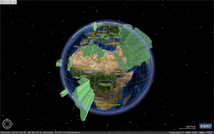
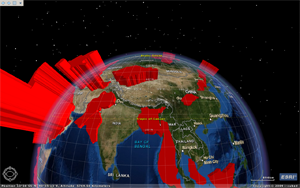
- Build an AGX project
- Navigate to various "views" and capture "slides"
- Place titles on "slides" if desired
- Activate the show by simply hitting the go button.
- Wow factor provided by the geobrowser platform, especially to non-geo audiences.
- Super easy to do, very intuitive workflow.
- From a presentation flow persepective, the platform allows for a nice, smooth talk with soft transitions.
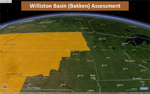
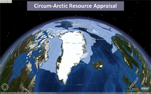
- Informative media, not a boring slide of text or some dopey picture from istock.
- Features can be identified, both to the data layer's attribute table or hyperlink field
- Because it is so easy, it isn't very feature rich. Aside from being able to add titles, there really isn't any way to annotate your slides
- It is pretty buggy. The identify functionality works about 90% of the time, guaranteed to not work when it really counts.
- Identify only works on "data layers" but not references created by layer files. This is problematic because you need to use layer files for rich symbology (from ArcGlobe). The work around for this is to add the layer as a data layer, make it 100% transparent, then add it with the desired symbology (using the layer file) for viewing.


3 comments:
I played around with this program quite a bit to see if I could put together and awesome presentation but just could not really get there. I discovered an online presenation tool call prezi (http://prezi.com) that blows it away in many departments. You can basically turn your presentation into a giant info graphic and use maps as a core element.
Part of me says, hey this is cool. Then I compare it to the rich tools available right now and have to reconsider. It's so simple that I wonder if it can really compete and not kill off ESRI's other offerings.
Thanks for the info. Always looking for different options.
Thanks for the info. Always looking for different options.
Post a Comment